Soccer
World Cup 2022: Ranking All 32 Nations’ Jerseys From Best to Worst
Joe Kozlowski began his career as a sports journalist in 2013 and joined Sportscasting in 2019. He covers the NBA and soccer for Sportscasting, with specialties in legacy NBA players such as Michael Jordan and Premier League club Arsenal. Off the clock, he's a Kansas City Chiefs fan and a hockey goalie. Growing up loving Shaquille O'Neal and reading everything he could about the great big men throughout NBA history — likely because he was still tall enough, at least relative to his peers, to play center — he's continued to love learning about and exploring the historical and story-based sides of the basketball archives. As for Arsenal, Joe spent a year living in London and latched onto the local support of the club. He's barely missed a match since, loving Arsene Wenger, enduring the Banter Era, and following along through rebuilds. The Premier League interest developed into a passionate following of the Champions League, Europe's big five league, and international soccer as a whole when played at the highest level. Regardless of the sport, Joe is captivated by the stories of athletes beyond the box scores and how they push the envelope — both in terms of what we think a human is capable of accomplishing and how they find new competitive tactics to win.
Get to know Joe Kozlowski betterPublished19 Nov 2022

While things remain pretty constant within the big four North American sports, soccer clubs will cycle through jerseys rather frequently. The basics don’t change — Arsenal’s home shirt, for example, always had a red body and white sleeves — there’s generally a slight tweak for each year. Add in both away and third kids, and there’s an entirely new wardrobe rolling out annually. Things might not be as drastic on the international scene, but you can be most nations will be hitting the World Cup stage with some new gear.
With that in mind, let’s take a look at all 32 nations and what they’ll be wearing in Qatar. The nations are ranked from best to worst, with both their home and away kits taken into account.
Ready to go? Let’s hit the metaphorical catwalk.
32. Senegal
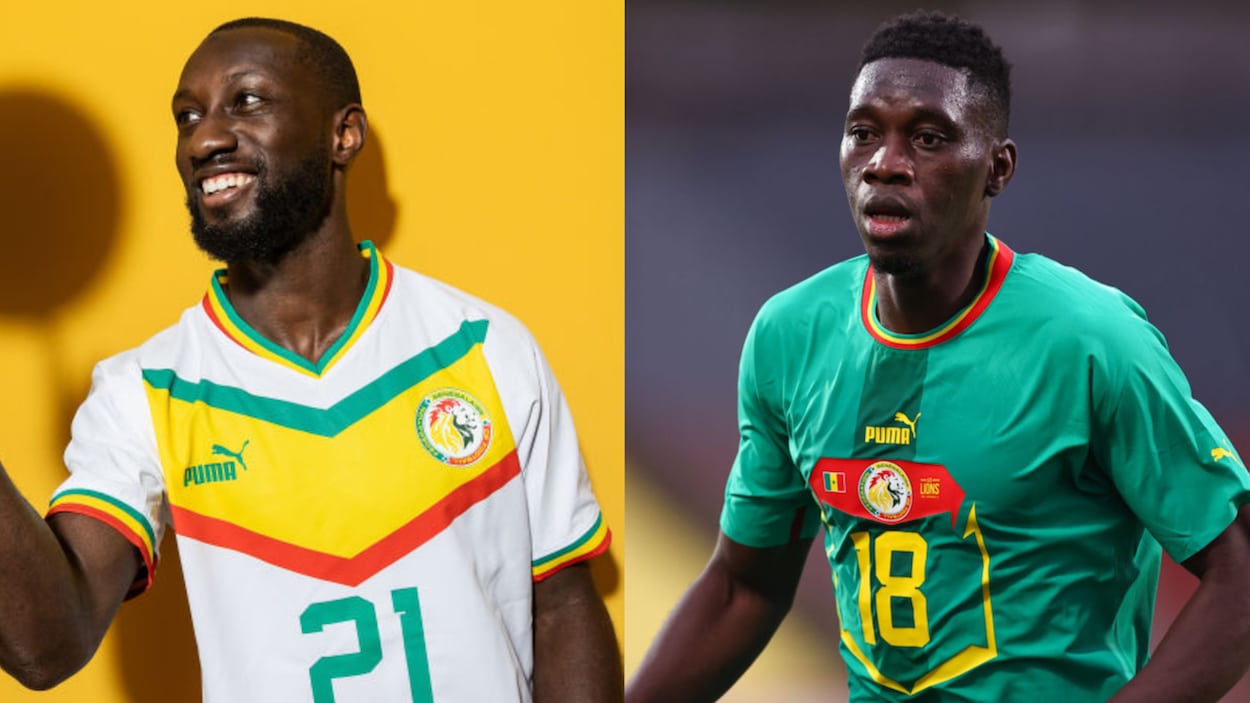
If Sadio Mane were able to play, Senegal would have one of the most exciting players in the entire World Cup on their roster. Unfortunately, he’ll be on the sidelines, and the squad will be wearing one of the worst jerseys in the tournament.
The white kit is actually pretty cool — I’m in favor of the retro look — but the away kit falls off the rails. The green is a less-than-ideal shade, and I genuinely can’t stand the Puma “running bib” template. The trio of flag, badge, and wordmark at the top of that section also looks a bit crowded for my tastes
31. Australia
If the Puma template is my least favorite part of the World Cup uniforms, the Nike shoulders come in a close second. While Australia’s away kit isn’t as bad as something like Tottenham’s purple wet suit, the dark body and teal neck accent make this one seem both ugly and bland at the same time. There’s just nothing redeeming about it.
The Socceroos’ primary kit does bring a bit of redemption, but it doesn’t reinvent the wheel or really move the needle.
30. Switzerland
The Swiss home jersey is solid if a bit boring. Once again, though, the Puma away template bumps the nation right to the bottom of the list.
If I said Senegal’s jersey looked like the players had running bibs pinned to their chests, the Swiss took that even more literally. The red rectangle on a white background literally looks like something you’d expect to see at a track and field event.
29. Morocco
We’ve got more Puma kits here, and while they’re getting better, they still aren’t a home run (sorry for mixing sports metaphors).
The primary red kit does bring a bit of a retro flourish to the party, but it’s a little bland. I also don’t care for how the green band breaks halfway through the shirt to accommodate the Puma logo. The away shirt is a stronger effort, thanks to the subtle background design, although I once again wish it wasn’t a stand-alone shape positioned at the center of the shirt. If the entire shirt had a similar pattern, we’d be talking
28. Canada
In complete fairness to Canada, I can’t completely blame them for their shirts. Nike said that “Canada Soccer is on a different kit development cycle” (h/t The Athletic), meaning they’ll head to the World Cup wearing little more than generic templates with the Canadian crest.
If you combine that with the fact that these kits aren’t egregious — they’re just boring — Canada ends up near the bottom but not in the absolute cellar.
27. Iran
This was a late change, as Iran didn’t release their World Cup kits until November, but that doesn’t really make a difference. We’ve got a relatively plain white shirt and a similarly plain red shirt, both of which have some subtle leopard spots on the sleeve.
I appreciate the reference to the country’s native animals, but it’s tough to look at this one and not see a much sadder version of Brazil’s away kit.
26. Costa Rica
It’s cliche to say that boring jerseys look like practice shirts, but that’s what we have here. Costa Rica’s away kit is especially egregious. It’s little more than a white top with a badge and blue bands at the bottom of the sleeves. The red version is a little better, but contrasting colors by themselves don’t make a shirt successful.
25. Cameroon
Cameroon is certainly going for something with their World Cup kits. The issue is trying to nail down what it is.
Earlier this year, the nation ended its relationship with Le Coq Sportif and teamed up with One All Sports. That’s left Cameroon wearing uniforms that have some bizarre stripes on the upper part of the chest. Are they supposed to evoke a lion’s head? Make the players look incredibly buff? Your guess is as good as mine.
And, while we’re at it, bring back the sleeveless kits, you cowards.
24. Uruguay
Stop me if you’ve heard this before, but I don’t care for the Puma away kits. Uruguay falls victim to that same trend, but the home kit saves the day. The iconic sky blue isn’t tainted with flourishes or gimmicks. Instead, it’s supported by a white collar, sleeve cuffs, and a single button. It’s so classic that it keeps the South American nation out of the depths.
23. Serbia
Another jersey, another Puma center-of-chest feature. In Serbia’s case, though, there is a redeeming factor: If you take the PR statements at face value, the central detail is a reference to Serbian history, as it’s a stylized version of the coat of arms on the statue of the Prince Mihailo Monument.
The home kit doesn’t blow me away, but it does get points for a unique shade of red and the subtle cross pattern.
22. Qatar
Qatar might not be a global power in the soccer space, but they’ve got some solid if unremarkable uniforms for their first World Cup.
The home kit is a bit bland, but I do appreciate the sleeve cuff reminiscent of the flag. The away jersey, however, scores some points for an unconventional color scheme — gold and beige — and an interesting pattern. I’m not sure how the circles and lines are supposed to suggest the coast and/or pearl diving, but they do add a bit of visual interest to the shirt.
21. Ghana
We’ve got another Puma nation, so you know what that means: a bad away kit. Ghana’s isn’t terrible, thanks to the red base and the consistent use of red, yellow, and green, but that’s as complimentary as I’m willing to get.
The home kit, however, is the star (pun intended) of the show. I really appreciate the bold simplicity of placing a black star at the center of a white shirt. The flag-based piping also makes another appearance, helping to avoid too much of a monochromatic experience.
20. Belgium
It might be surprising to see a big-time European nation so low on the list, but I’m not picking up what Belgium is putting down this year.
The home kit is fundamentally the same as it’s previously been, plus the addition of some flames on the sleeves. There’s playing homage to a nickname, and then there’s taking things too literally. This is firmly in the latter category.
The away kit is a bit more interesting, but a largely white uniform with some small accents doesn’t really evoke a music festival full of color and fireworks. If Adidas was going to use Tomorrowland as the inspiration, they should have gone all out.
19. United States of America
This isn’t exactly a hot take, as the USMNT doesn’t exactly love their own jerseys.
The home jersey is just boring, and it features the current Nike neck and shoulders that I don’t like. The away kit is a bit more exciting, but as I said with Belgium, going half-hearted into tie-dye just doesn’t do it. If you’re going to try and be bold, you have to fully stand behind it.
Call me when the denim returns.
18. England
I’ve made a bit deal about disliking the Puma kits, but now we’re into the Nike portion of the programming.
England find themselves in the middle of the back simply based on the home kit. I don’t like the rounded shoulders, and the blue gradient fails to move the needle. The away strip, though, looks pretty good. I think I’d prefer a uniform navy blue instead of having darker and lighter accents, but that’s nitpicking.
17. South Korea
I’m a bit more conservative on South Korea than some, so stick with me.
The home kit is pretty solid. I like the shade of red, and the tiger stripes are an acceptable use of the Nike shoulders. I’m a bit colder on the away kit, though. I’ve seen it getting plenty of praise, but I can’t look at it without thinking of the similar RB Leipzig kit. Even if it’s not a direct recycle, that parallel makes it a little less special in my eyes.
16. Poland

I’m biased toward Poland, but I do think it’s kind of fitting that they’re exactly in the middle of the ranking. The home kit tries to do something interesting with a shoulder detail evoking eagle feathers, but it’s a bit subtle and still falls victim to the Nike shoulders. The away kit is incredibly clean, but it could a pro or a con, depending on your tastes.
As I said, perfectly middle of the road.
15. Ecuador
While you might not have expected to see Ecuador in the top half of the table, they just made the cut. The first-choice uniform gets points for being yellow — it’s not a super common color, but it pops when done right — and the away jersey really shines. I appreciate the pattern, and I respect the choice to use a white version of the badge rather than slapping the standard version onto a mismatched top.
On the whole, a surprisingly strong effort here.
14. Wales
The home kit is like a slightly better Poland away kit — I usually like the signature Adidas stripes — but I’m a surprisingly big fan of the away kit. The big collar is a bit reminiscent of those weird black and orange Chelsea third jerseys from a few years back, but I appreciate the bold red and green pattern on the collar and sides. Is it a little chunky and dissonant? Maybe, but I’m giving points for the effort here.
13. Croatia
For better or worse, you know you’re going to get a checkerboard from Croatia. How you feel about their jerseys will largely depend on if you think that pattern is garish, iconic, or somewhere in between.
To be completely honest, I’m not the biggest fan of these. I appreciate the uniqueness and the tie to Croatia, but I’m not in a rush to wear one myself. With that being said, though, the decision to make the pattern on both kits slightly non-uniform is a nice touch.
12. The Netherlands
Now we’re getting into the big boys.
Over the years, the Netherlands have donned some iconic kits, but this year’s won’t reach those heights. The primary uniform isn’t orange enough — if I saw it on a rack without the crest, I’d think it was gold — and the pattern fails to elevate it. The away kit is better but falls victim to the Nike panels. Without that weird chest/shoulder area, the blue and orange would be a home run.
11. Denmark
It’s a bit tough to judge the Danes here. Their uniforms are boring — the home is solid red, and the away is solid white, and the third is solid black — but there is significance to those choices. As laid out in a Guardian article, the primary kit aims to “criticise the human rights record of the host nation Qatar, with a black option unveiled to honour migrant workers who died during construction work for the finals tournament.”
On one hand, the kits don’t exactly hit a home run from a design perspective. On the other, though, they are visually striking and do earn plenty of points for making an important statement. Through that lens, sitting just outside the top 10 feels about right.
10. Argentina
When it comes to Argentina, there’s not much that can be said about the home jersey. It’s a classic, and unless you do something stupid, you really can’t mess it up. Adidas might not have reinvented the wheel here, but they did create a clean shirt that looks as good as ever.
The away kit isn’t great, but I’m less offended by it than others. I honestly didn’t realize it was supposed to evoke flames, but that’s probably a good thing. I thought the jersey was just supposed to be blue with some purple accents, which felt perfectly middle-of-the-road.
The home jersey, however, really carried Argentina.
9. Portugal
Score one for Cristiano Ronaldo over Lionel Messi! (I’m kidding, please don’t do that based on a jersey.)
The primary kit isn’t my favorite, but I don’t hate it, either. Portugal and Nike do get points for going bold and making a clear connection between the nation and the uniform. That’s what I want to see, especially for a World Cup.
I actually think the away kit is a very strong effort. The white feels crisp when juxtaposed against the horizontal bar, and I appreciate that bar mimicking the Portuguese flag. It’s a nice compliment to the home kit. One is a bit bolder, and the other is more understated, but they both make it 100% clear what team you’re looking at.
8. Germany
Germany is one of those teams that you can’t do too much with before crossing the metaphorical line. We see that in the home kit. It’s clean, and I appreciate the gold accents and German flag piping, but it’s nothing we haven’t seen before.
The away kit is a bit more interesting, and it reminds me of the Japanese kit we’ll see elsewhere on the list. It’s not too out there, but it does pull the traditional colors into the design in a slightly unconventional way.
On the whole, a strong effort, although there’s nothing that makes me stand up and applaud.
7. Brazil
Brazil is always going to rank favorably simply because of their primary jersey. When you come to own an entire color scheme — sorry, Norwich — that tells you something. I can take or leave the Jaguar print, but a more Brazil kit will never not look great.
On the away kit, though, things get a bit bolder as the traditional blue gets some prominent Jaguar spots. I’m not 100% sold on the design, but I will give Nike credit for being bold and bringing an element of the Amazon rainforest into the uniform. There’s more to Brazil than Rio, after all.
6. Tunisia
On first blush, this ranking might seem shocking. How could Tunisia, a relative minnow in the World Cup, come within touching distance of the top of the jersey-based mountain? Let’s break it down.
Tunisia’s primary and away kits are fundamentally the same, just with different colors and a slightly different pattern. That pattern, though, is the key, as it evokes ancient Carthaginian armor. Not only am I a sucker for an all-over background pattern, but this uniform gets extra points for being so firmly rooted in a cultural identity.
I give the white kit a slight nod because the armor graphic is a bit more obvious, but both are genuinely good options.
5. Spain
Spain’s home kit is another one where you can’t really do too much. It’s clean, classic, and perhaps a bit safe, but you know what you’re going to get there, though. The away uniform, however, shines. Not only is the pale blue a unique color choice, but it really pops against some royal blue shorts. The pattern — whatever it’s supposed to be — is also fun, which is refreshing to see on the global stage.
Sports, after all, are supposed to be fun.
4. Saudi Arabia
Like Tunisia, you might not expect to see Saudi Arabia at the top of this list. I’m generally a fan of background prints, though, which carried them this far up the ladder.
The home kit gets points for a bold shade of green but falters a bit when it comes to the pattern. The jersey almost reads as something stereotypically “tribal,” which I assume wasn’t the intention. This one comes close but falls the slightest bit short.
The white shirt, however, connects the dots. The pattern is more subtle — it’s gray on white — and intelligible — it’s technically supposed to be palm leaves, but the design also evokes eagle feathers — making a much stronger kit. The green is also a nice compliment to the white, even if it’s the nation’s standard color scheme.
3. Japan
Japan makes it this far on the back of one of the tops of the tournament. The nation’s primary blue kit has everything I’m looking for. It’s bold without being garish, has a cultural connection (the pattern references Sashiko stitching and kimonos), and is just cool. I also think the nation has a high-quality badge, and the white Adidas stripes help set things off.
The away kit, however, keeps Japan from climbing higher up the list. It’s just a white shirt with some red and blue Sashiko-style patterns on the sleeves. If there’s anything at all on the body of the shirt, we could have had a different first-place team.
2. France
The defending champs don’t quite make it to the top of the jersey rankings, but they do put in a strong showing.
The home kit is classy and understated. I appreciate the choice of navy blue, and think it’s really set off by the gold accents. I might be delving a bit deep into the realm of cliche here, but this almost feels like Gallic confidence distilled down into a single item. France knows they’re good and doesn’t need to prove that to anyone.
The away kit also shines, but for different reasons. From afar, the jersey almost appears to have a camouflage pattern, but upon closer inspection, those blotches are images of the Arc de Triomphe and Clairefontaine (the nation’s legendary youth academy). The style is reminiscent of French Toile de Jouy, giving a bit of an additional cultural tie-in. On a shirt-by-shirt basis, this one is top-three in the entire tournament.
1. Mexico
If you’ve spent any time looking at jerseys ahead of the World Cup, this one shouldn’t be a surprise. Mexico has a new badge, and Adidas produced some all-timers to go along with it.
The home kit could stand on its own — the red and green work really well together, and the pattern adds some visual interest without getting too busy — but the away steals the show. I’m not exactly sure what to call the colors, but the cream and maroon are distinct without being silly. The pattern, which provides an obvious reference to Mexican history, is visually interesting without making you feel dizzy. Everything works, and this is undoubtedly a kit we’ll see reach cultural immortality.