NBA
NBA Jersey Rankings: Every 2024-25 City Edition from Worst to Best
Published4 hours ago on October 08, 2024
For a hoops and fashion nerd like me, NBA city jersey release season is my Christmas. Unfortunately, our proverbial Santa dropped the ball for what feels like the third straight year. No, you’re not just old and jaded. City jerseys don’t shimmer like they used to.
The majority of these new kits are fine at best. There are still some standouts, though, so let’s rank all 30 city edition jerseys. We’re splitting these up into five tiers. Tier placement here matters more than the actual order, though we will rank all uniforms ordinally.
Please remember that these are solely based on my subjective, unscientific opinion. It’s tough to quantify how cool something looks, so I won’t attempt to do that. Some of these jerseys attempt to tell a story. Most of those stories are written in unintelligible gibberish, so I’ll do my best to decipher them. If I’m negative about your favorite team’s jersey, you could take solace in the fact that most of these stink to some degree.
All of the photos here come from this Uniwatch article.
What were you thinking???
-
Los Angeles Lakers
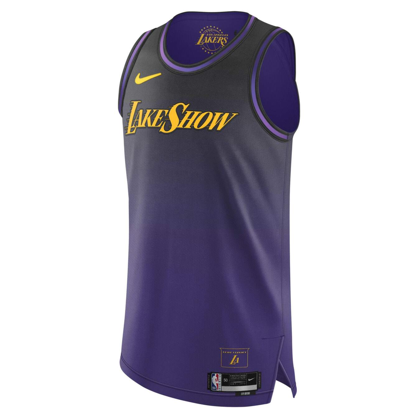
These are an affront to the basketball gods. It’s hard to mess up the Lakers’ purple and gold, but they managed to tarnish it. Bravo.
-
Boston Celtics
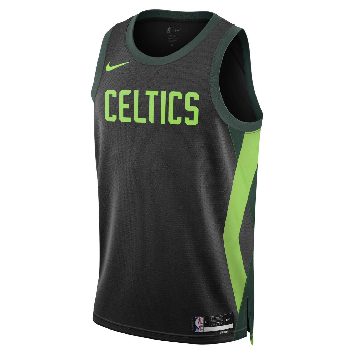
It’s disappointing to see two of the league’s most historic, iconic brands flop this hard. Enough with the black and neon! You’ll never be the Seahawks, no matter how hard you try.
-
Minnesota Timberwolves
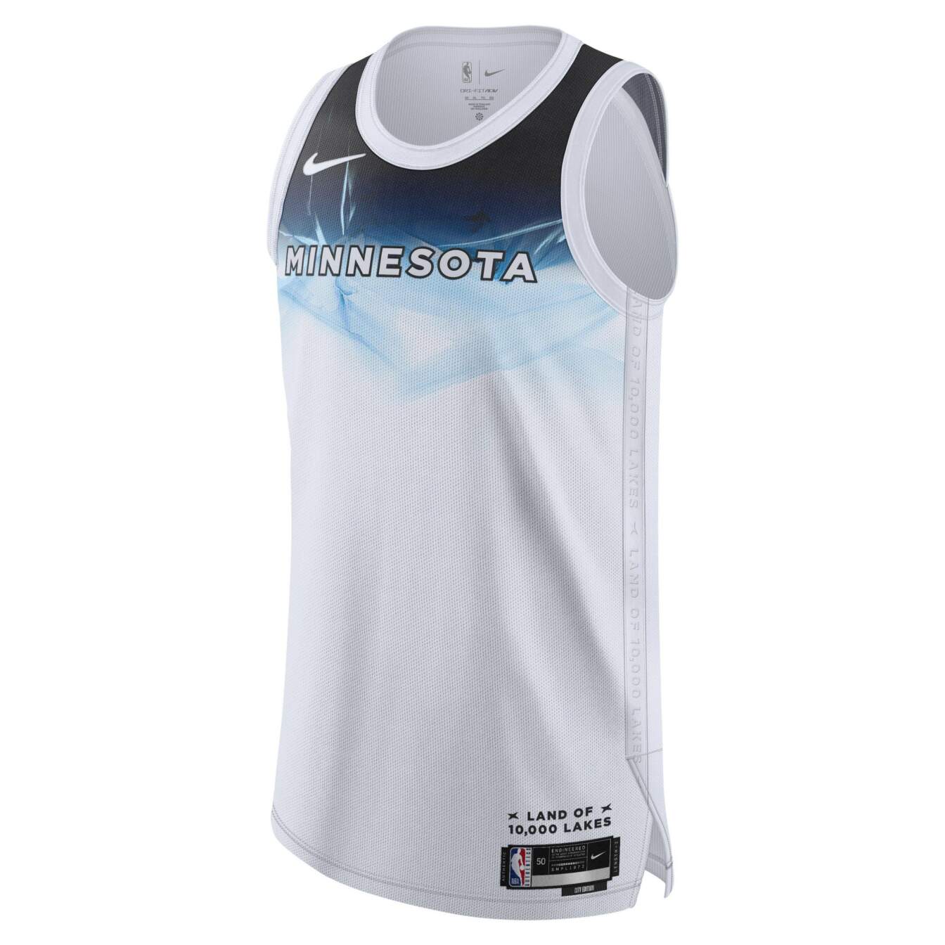
There’s so much potential for beautiful kits with Minnesota’s color scheme and aesthetic. This glorified practice jersey is a massive disappointment. Why not creatively depict the aquatic theme instead of chucking plain text in the bottom corner?
-
Miami Heat
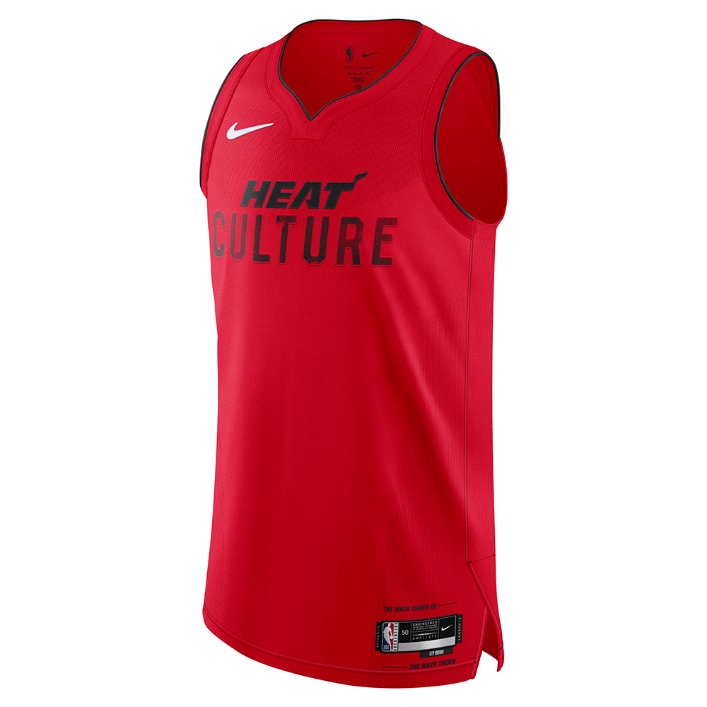
Abandoning the universally loved Miami Vice series for this mess is a huge bummer. It wasn’t broken. They shouldn’t have fixed it!
Bad, but not offensive.
-
Golden State Warriors
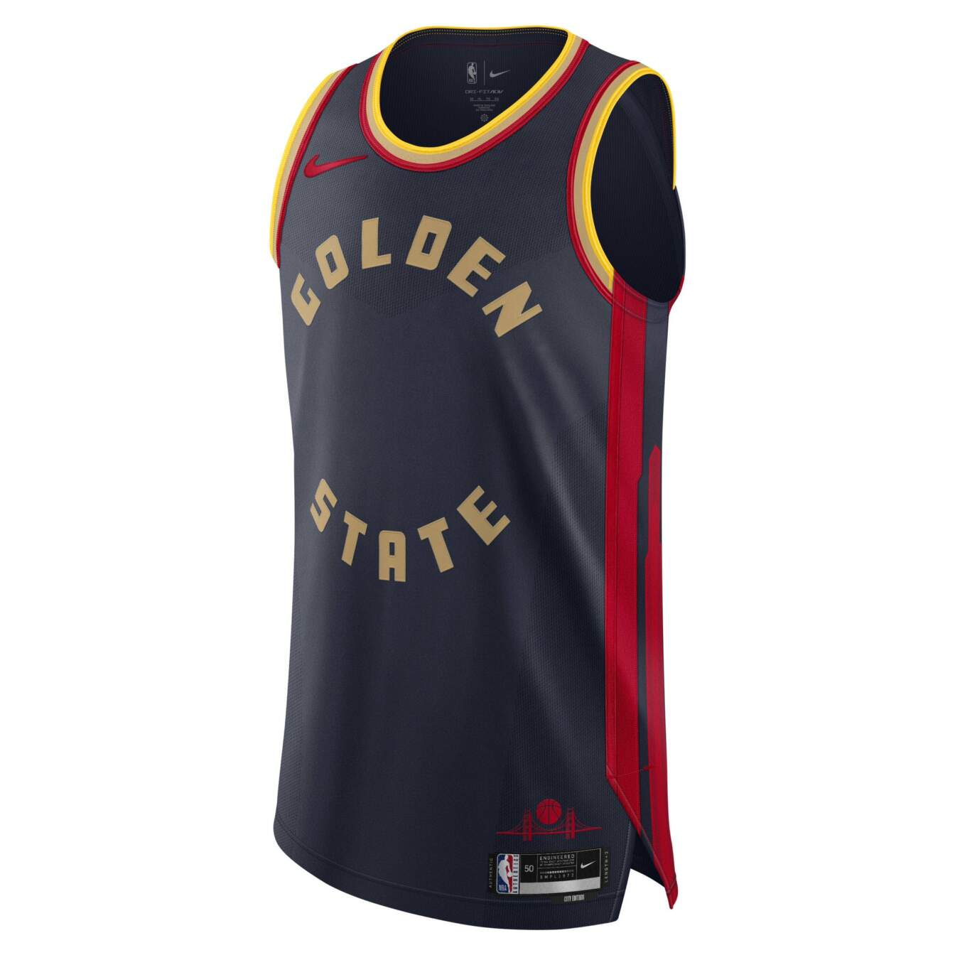
Something about the deep navy blue with the loud yellow and red doesn’t work for me. There’s potential, but this feels lazily thrown together.
-
Washington Wizards
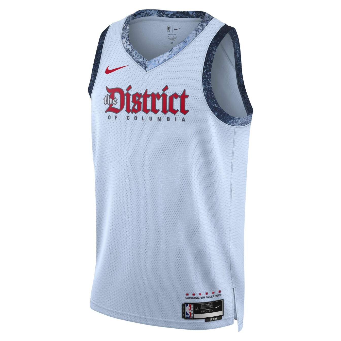
It’s a boring jersey spoiled by the Arctic-looking trim. We’ve seen so many beautiful Wizards jerseys over the years, making this even more disappointing.
-
Houston Rockets
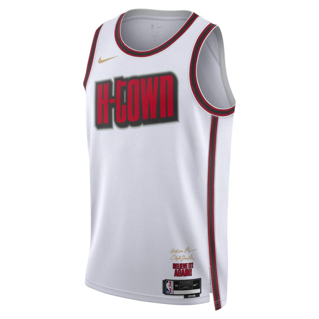
I appreciate the inclusion of the bottom-corner text. That adds character, but this is an ultimately bland jersey with a font I’m not crazy about.
-
Dallas Mavericks
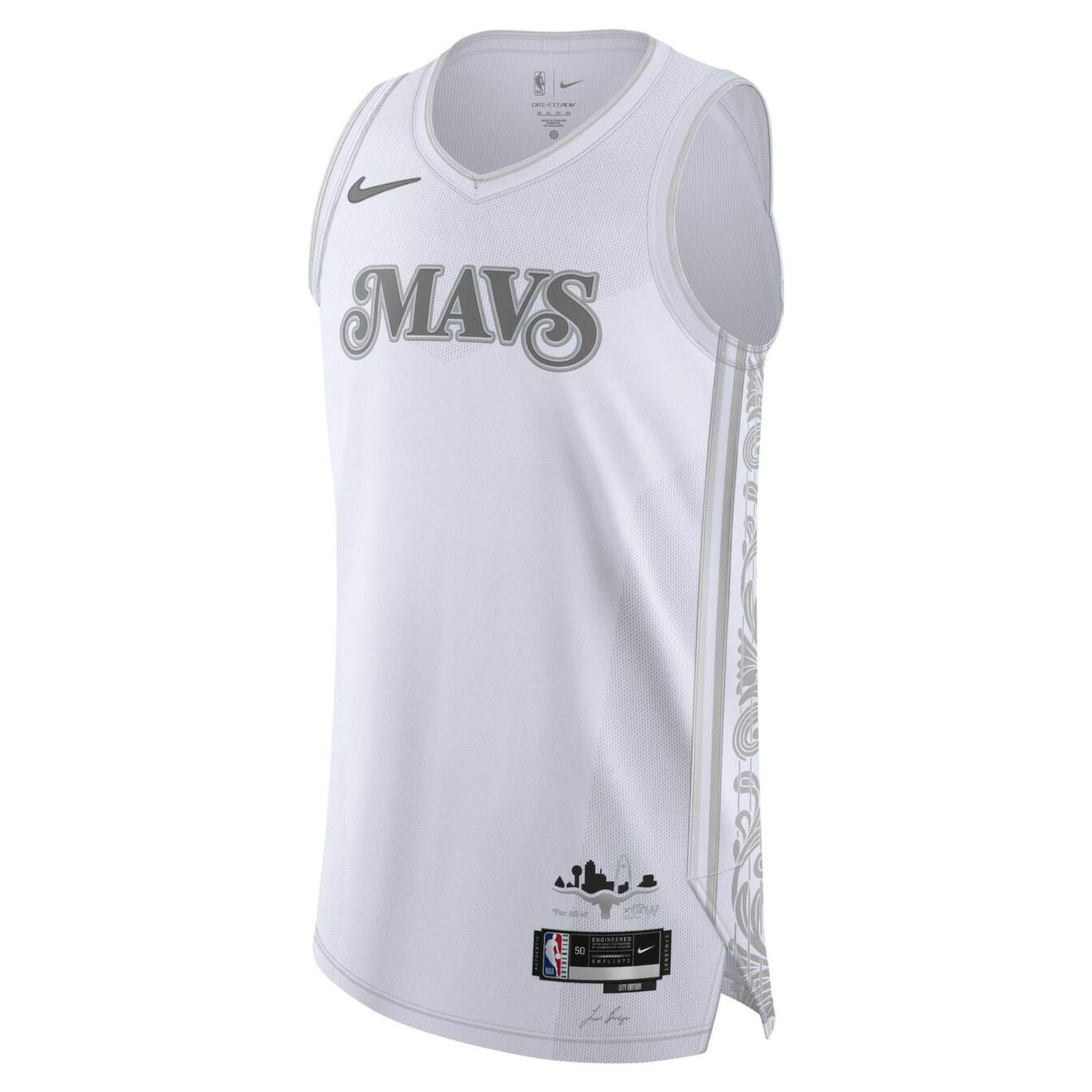
Another white and gray jersey with a trim stolen from my grandma’s tablecloth? No thanks. I do love the Longhorn holding up the Dallas skyline in the bottom corner. I wish they incorporated that more heavily.
-
Chicago Bulls
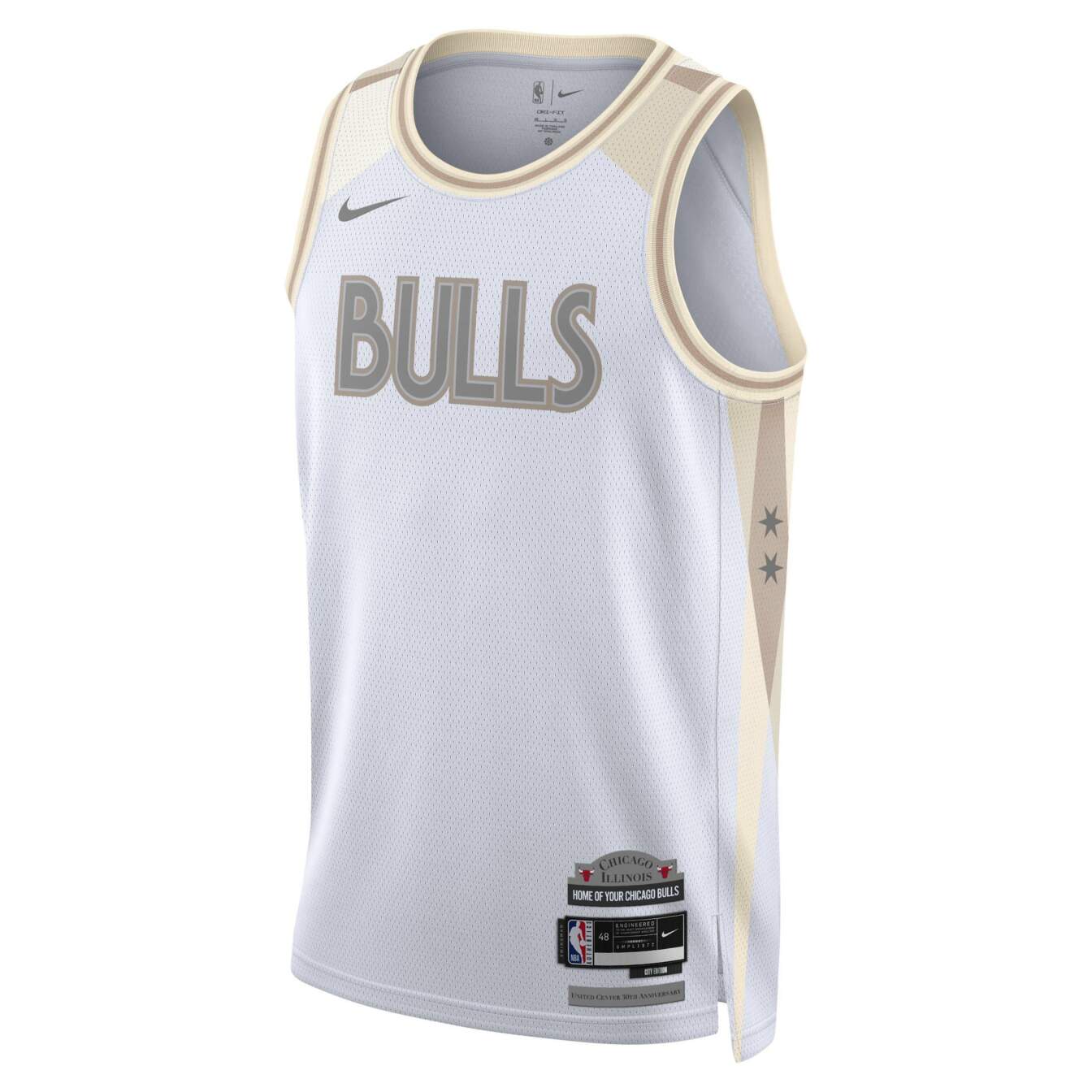
It’s a fine kit that doesn’t evoke the Bulls in any way. You really can’t do a Bulls jersey without any red, especially with a basic font and a boring white and pale gold scheme.
-
Denver Nuggets
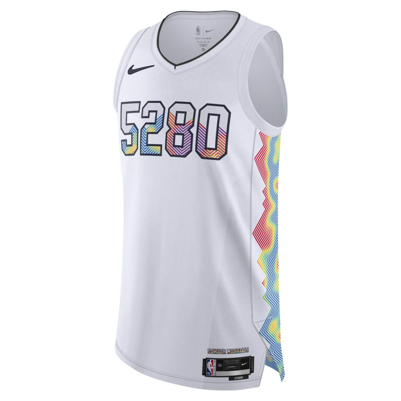
I’m just now learning that the Nuggets play 5,280 feet above sea level. Who knew? There’s something good here with the rainbow heat map, though. Denver’s colorful throwbacks are some of the most beloved jerseys of all time. Why not add more color here?
-
New Orleans Pelicans
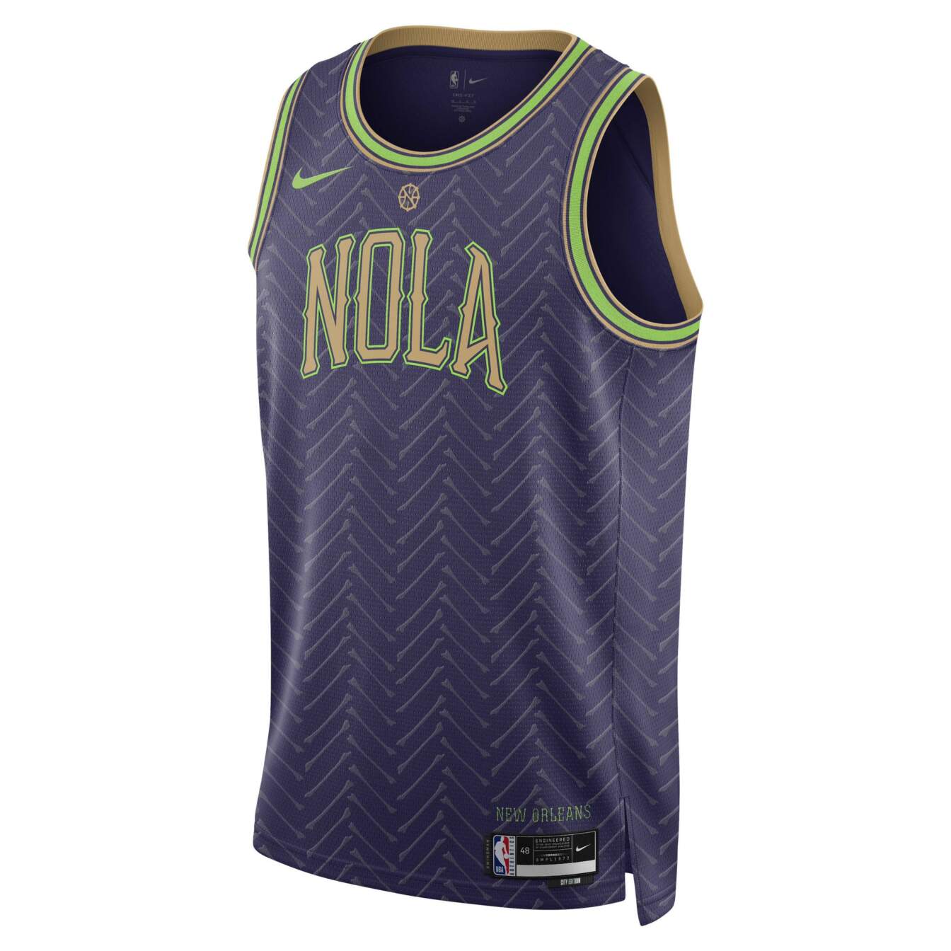
The Pelicans will try and fail to replicate the magic of the original Mardi Gras jersey every year. The colors are too muted, but the bones (I think?) lining the front of the kit add a nice texture.
-
Portland Trailblazers
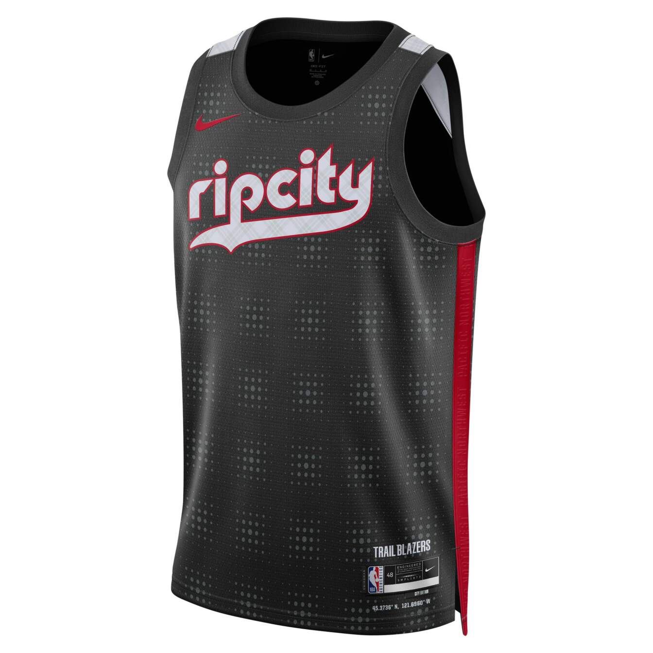
Why did they put a bunch of tiny grid illusions all over the jersey? Why is “Rip City” textured with faint plaid? I have so many questions about this one.
-
New York Knicks
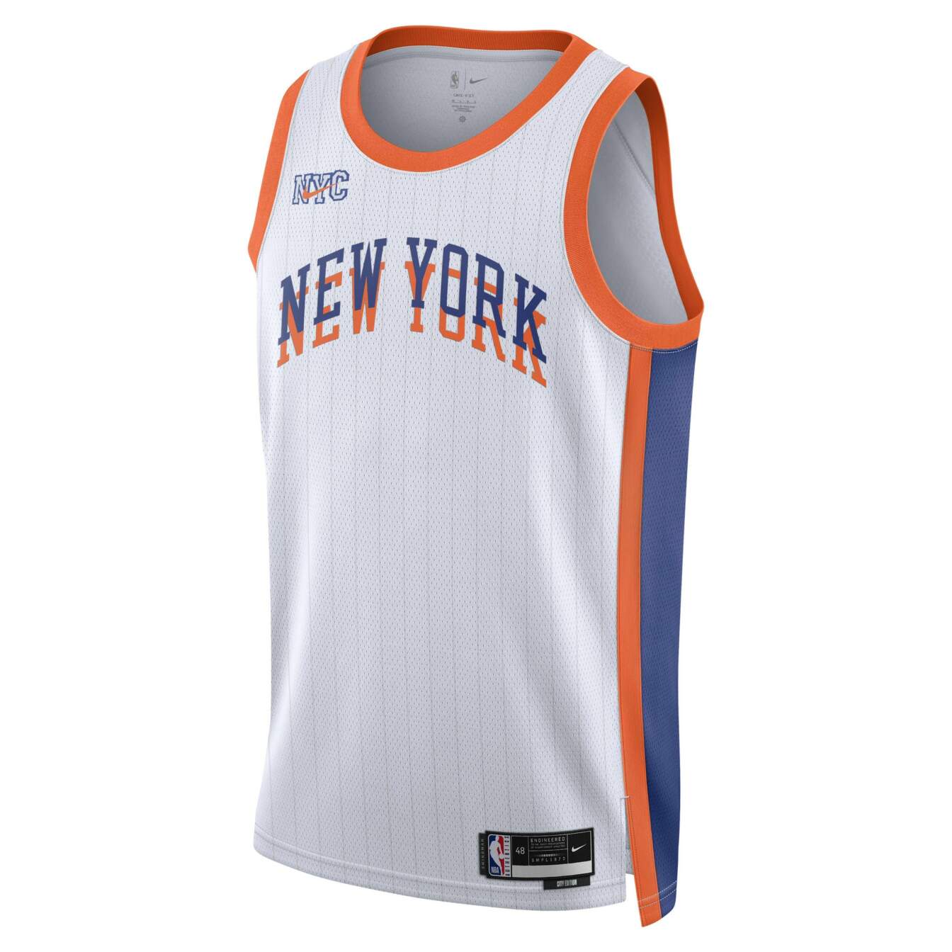
I like the pinstripes and the overlaid font on the front, but this one still feels incomplete. One more element, maybe on the trim or lower on the uniform, could make these great.
Fine, I guess?
-
Brooklyn Nets
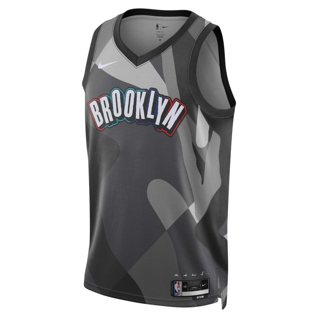
This is far from Brooklyn’s best city jersey, but the playground aesthetic raises the floor of how bad it can be. I love the font and colorful outline. I wish the jersey had a bit more color throughout.
-
Sacramento Kings
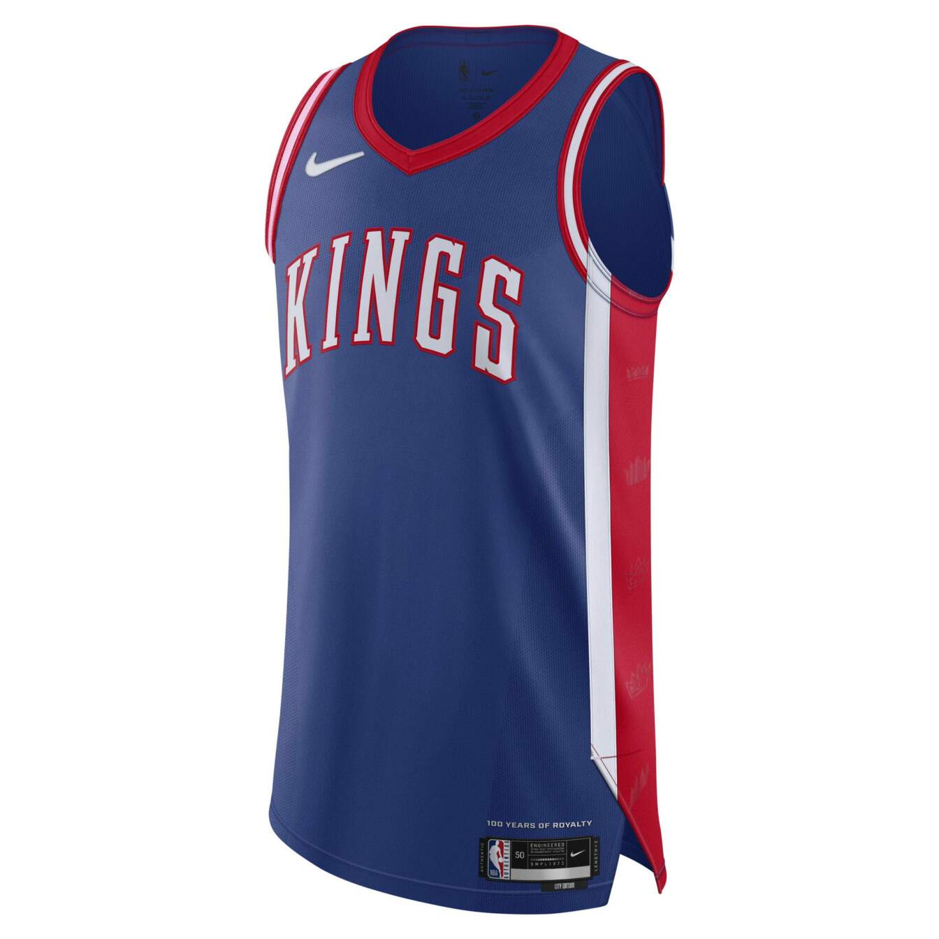
It’s hard to mess up royal blue, red and white. Sacramento’s best jerseys incorporate purple and/or light blue, but this one is solid.
-
Oklahoma City Thunder
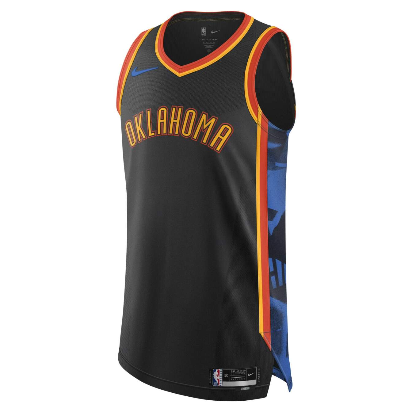
The internet hates this jersey far too much. These are similar to last year’s jerseys, which looked much cooler on court than they did in the leaks. I’m trusting the process with these.
-
Los Angeles Clippers
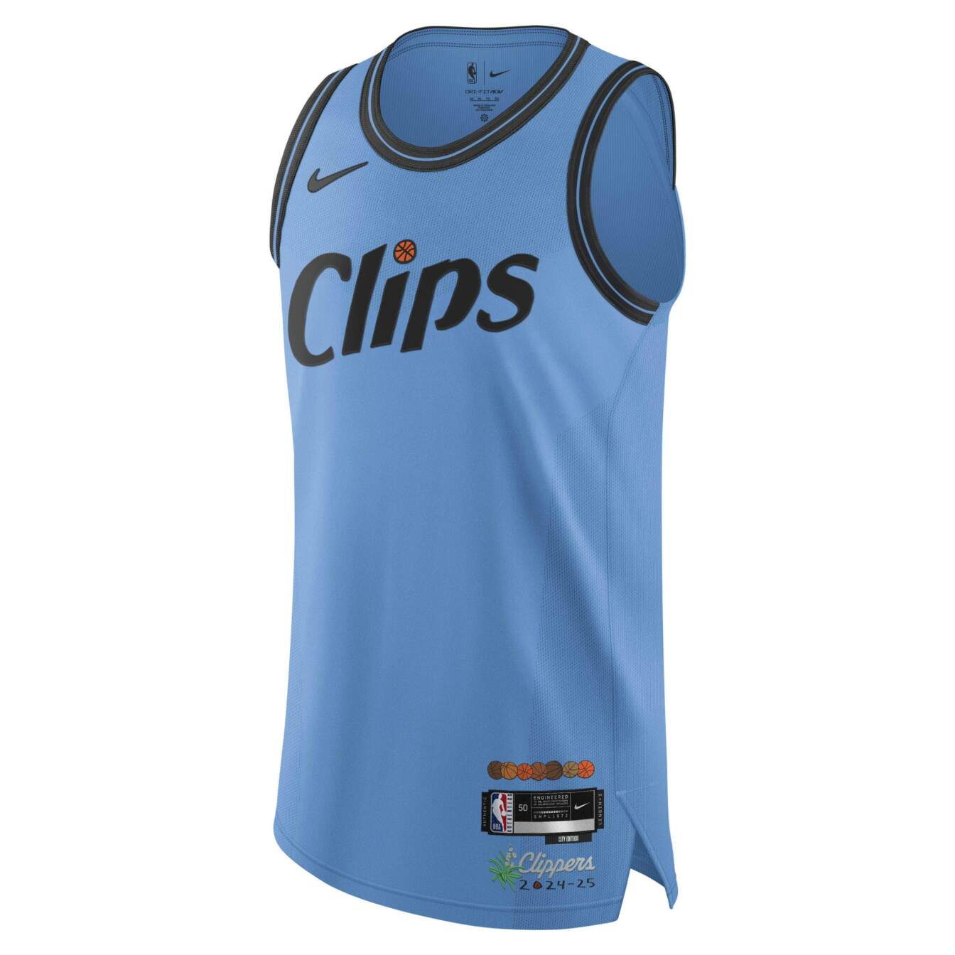
I’m a sucker for light blue, as we’ll see throughout the rest of the list. There’s nothing crazy here aside from the pleasing synergy of light blue and orange. I wish there was more orange on this jersey, though.
-
Indiana Pacers
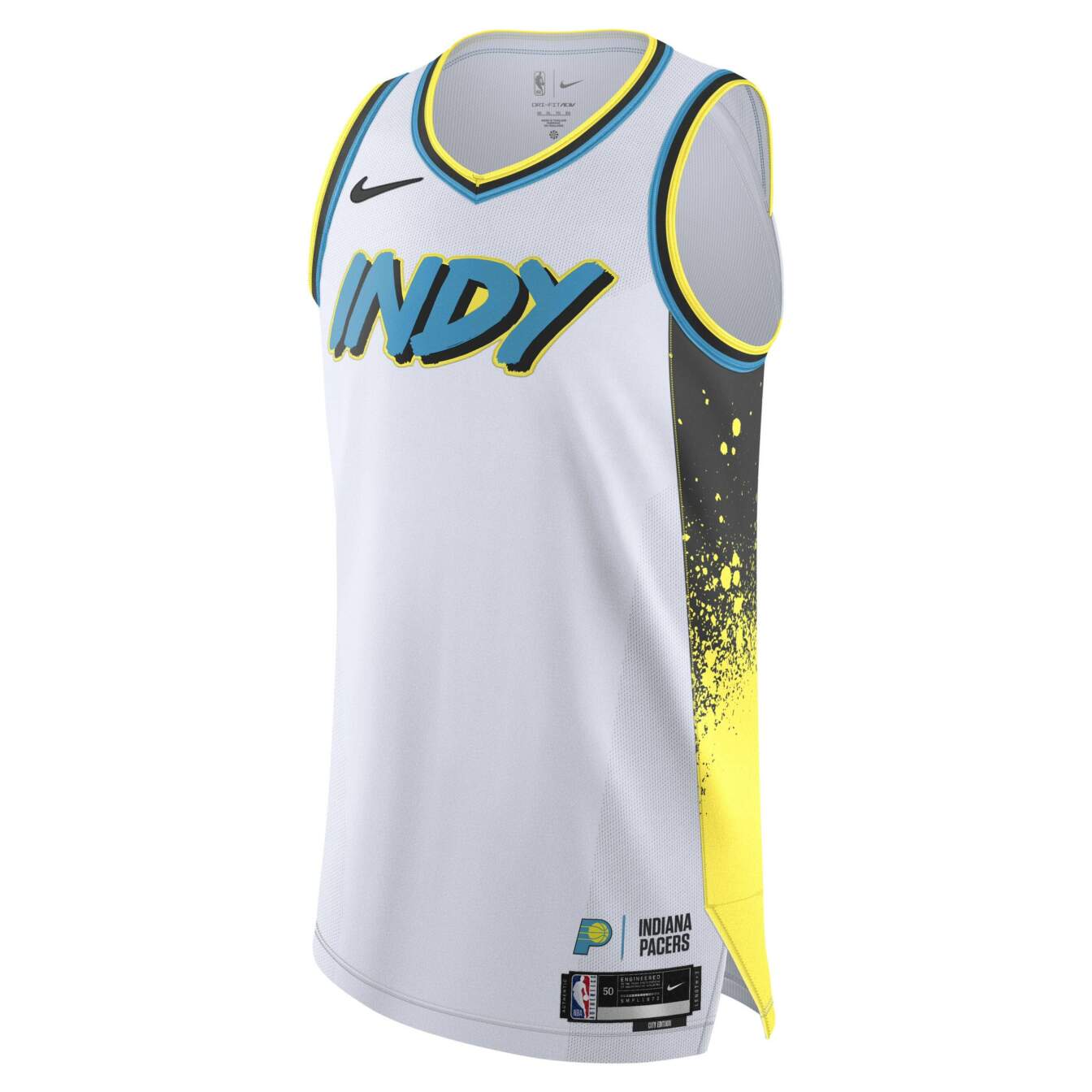
These are the exact same city jerseys as last season with the base flipped from black to white. I’m not as crazy about the splotchy design, but I appreciate the bold direction they’re going here. Replacing the dark gray on the sides with another color might improve the cohesion of this aesthetic.
-
Charlotte Hornets
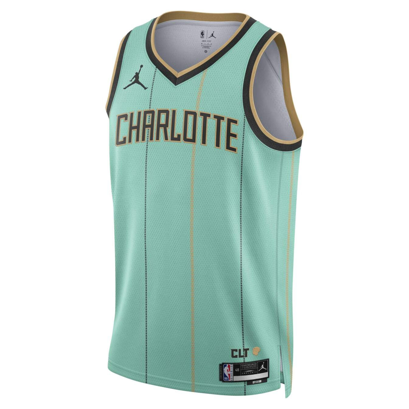
The teal blue and gold carry this jersey hard. Outside of the beautiful color scheme, there’s not much here, but that’s enough to put it ahead of most of these bummers.
Shockingly solid!
-
Philadelphia 76ers
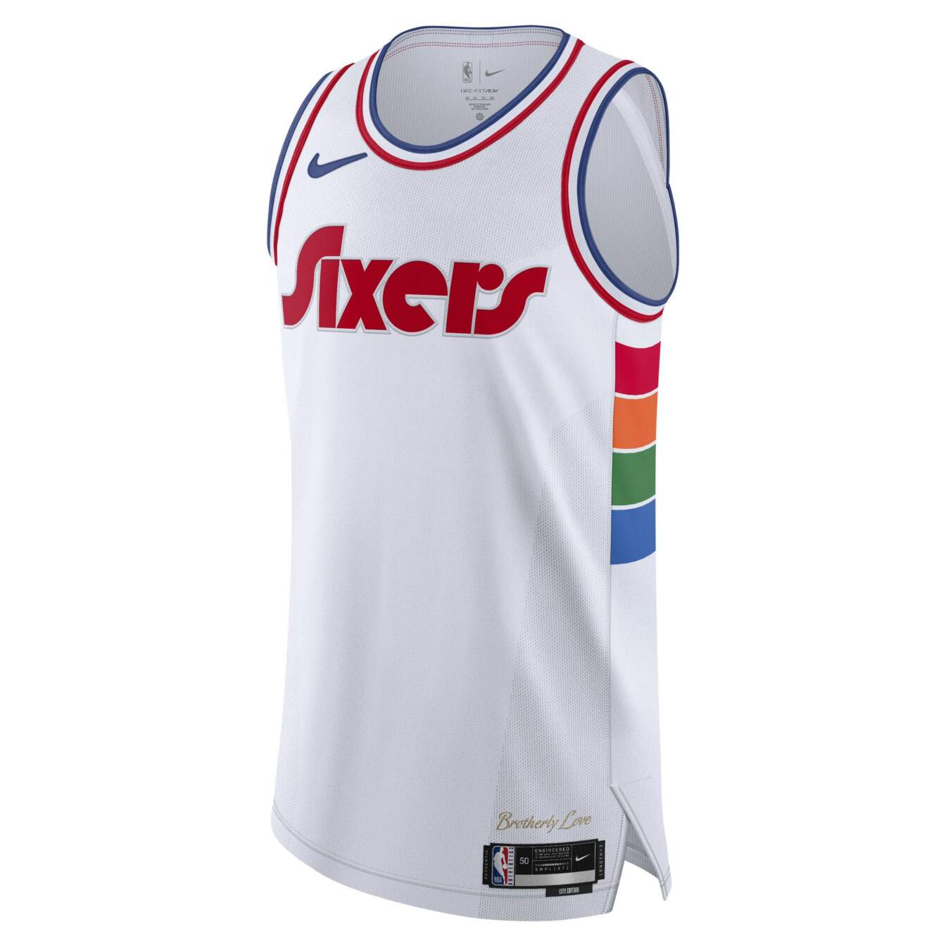
The Sixers retooled their 2021-22 city jersey and improved it with the white base. The retro font is fantastic. The color blocks on the side provide enough pop without being overwhelming. It’s a solid, unpretentious jersey.
-
Orlando Magic
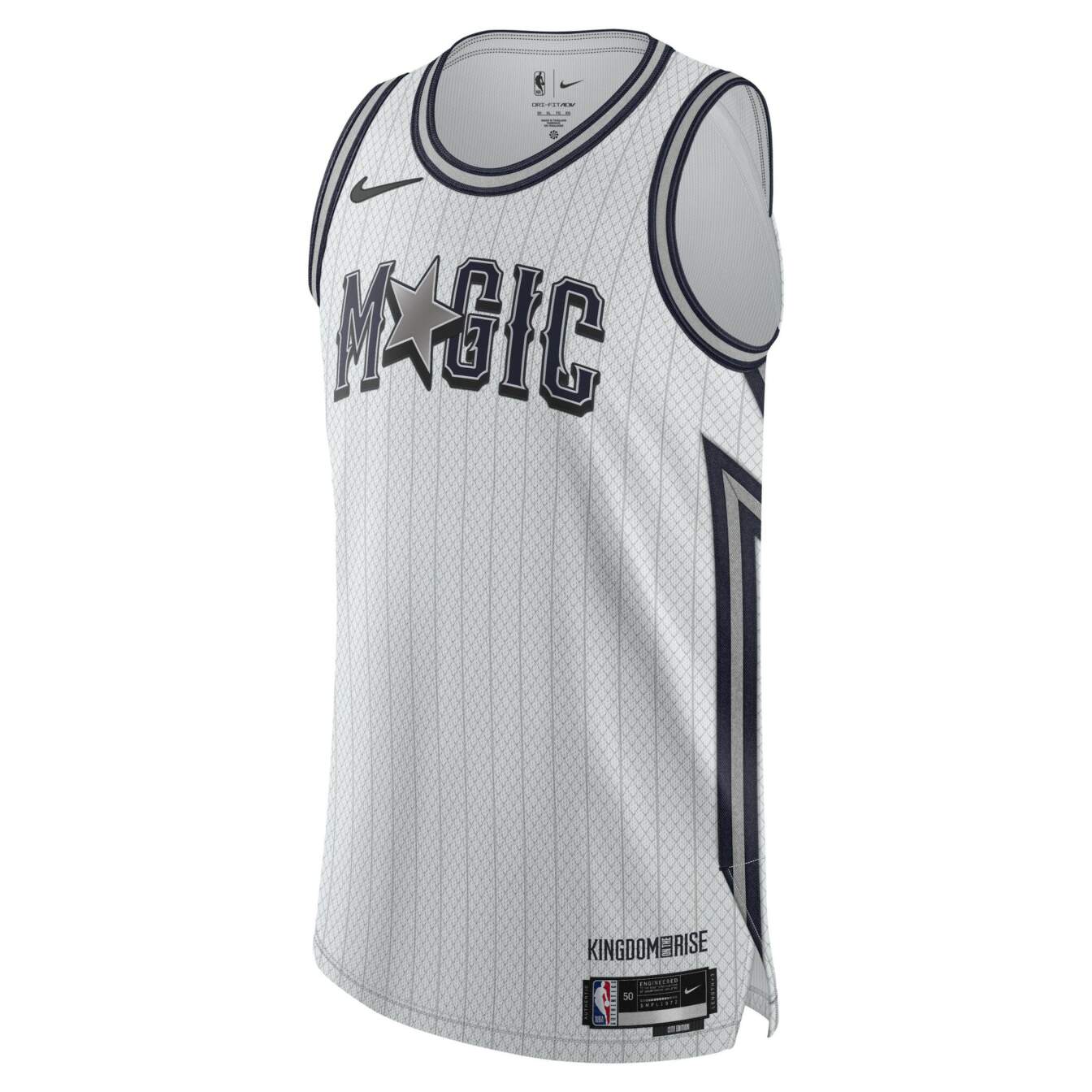
I’m normally harsh on white and gray palettes, but something about this jersey works for me. The font is phenomenal and the pinstripes are classic. It looks a bit too much like a Spurs jersey, but otherwise, I’m a fan of this one.
-
Atlanta Hawks
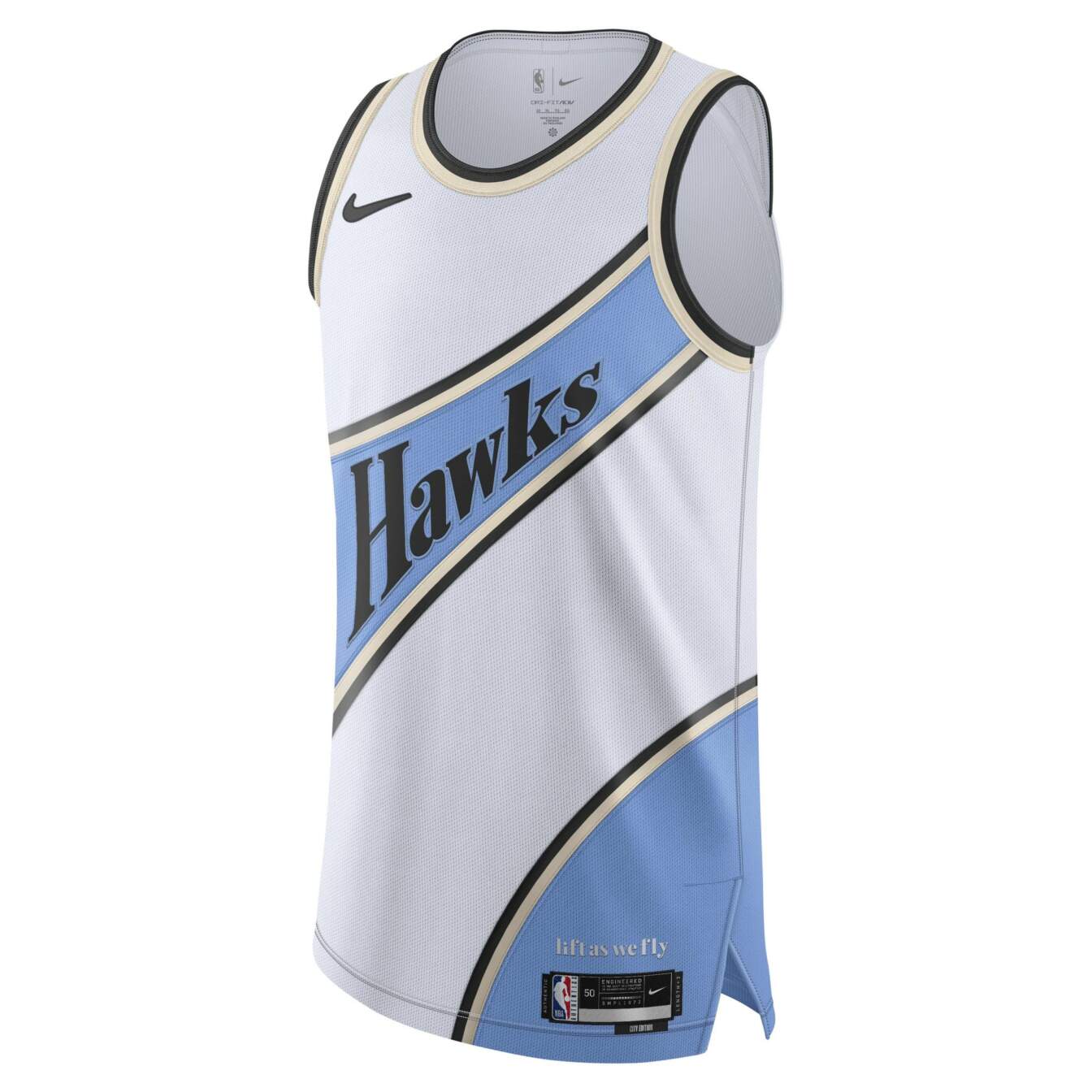
This color palette — baby blue, gold, white and black — might be my favorite quartet of any city jersey. I appreciate this one seemingly paying homage to the classic red and white kit with the diagonal color bands
-
Detroit Pistons
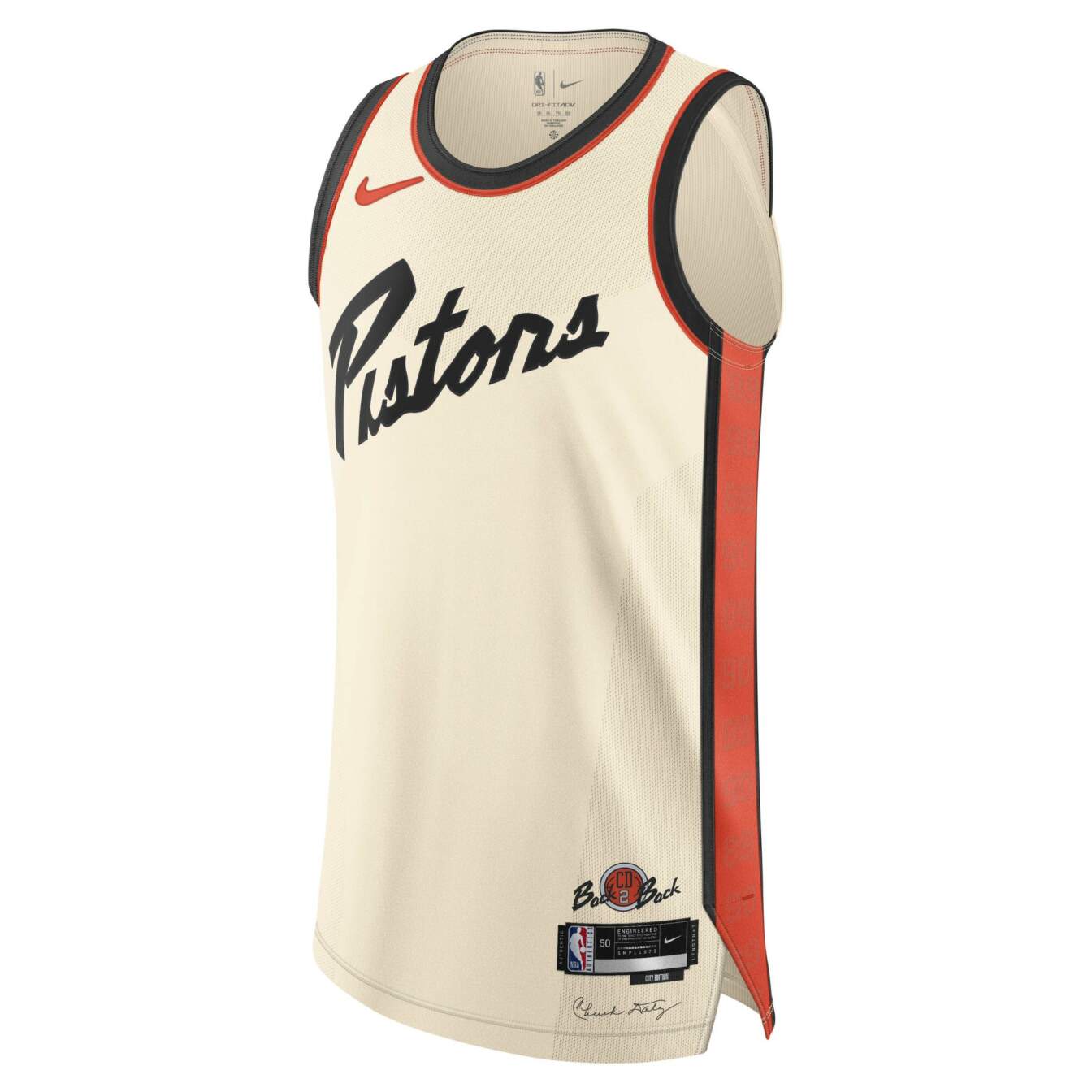
I don’t love the font as it’s a bit hard to read, but the orange and cream blend beautifully together. Adding detail to honor late head coach Chuck Daly was thoughtful and well done.
-
Milwaukee Bucks
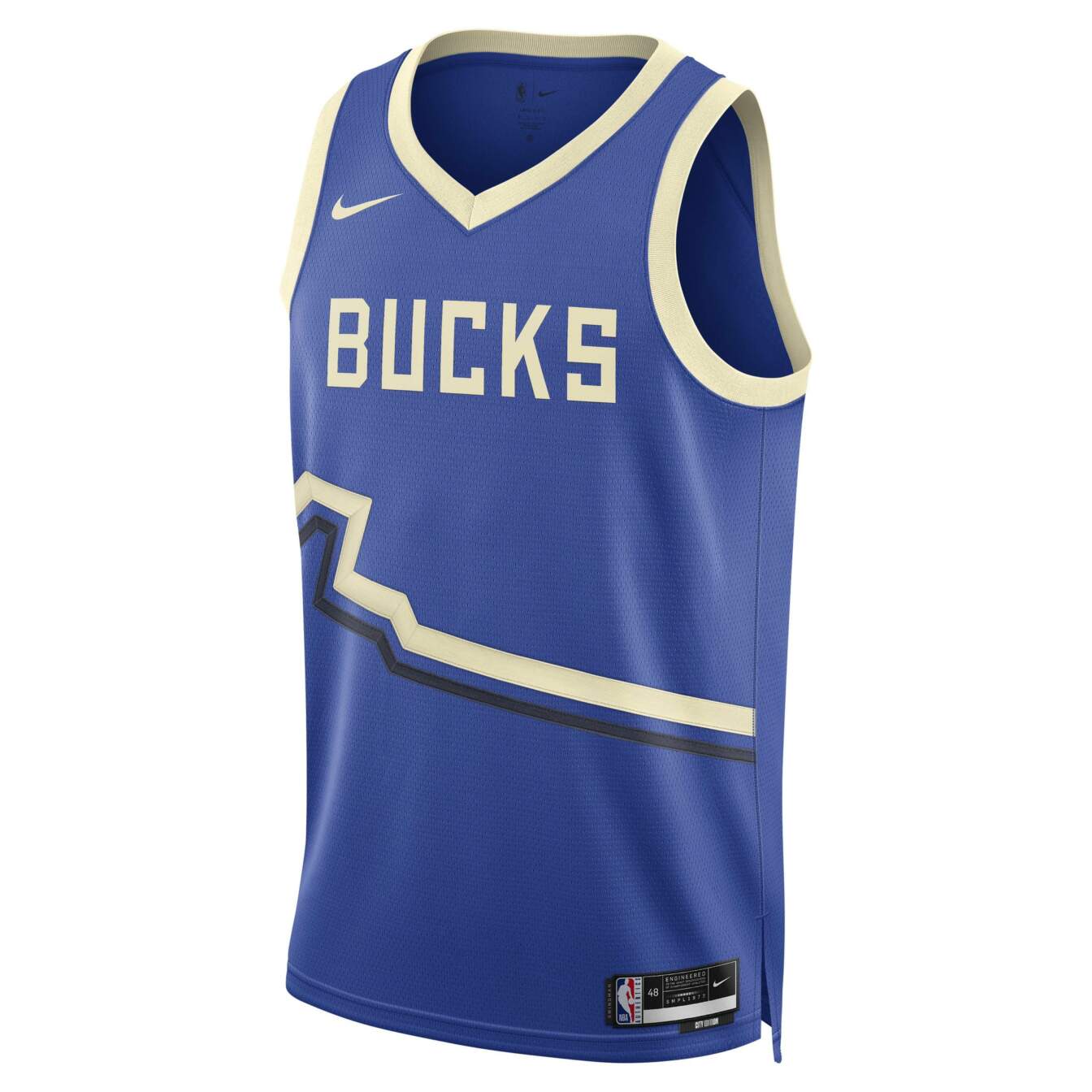
Of all of Mikwaukee’s dark blue jersey iterations, this one might be their best yet. The black and cream trim contrasts so well with the base color. Nothing here feels superfluous, which was my main gripe with Milwaukee’s other blue kits.
-
Cleveland Cavaliers
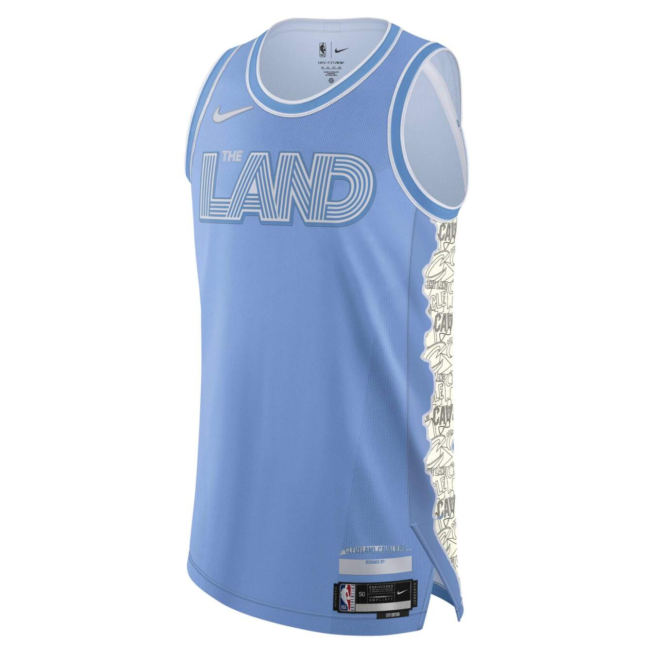
This is my perfect, platonic ideal shade of sky blue. I’m not crazy about the font or the trim on the side, but the primary base color looks fantastic. I can’t imagine the little details will detract from the overall blue on court.
-
San Antonio Spurs
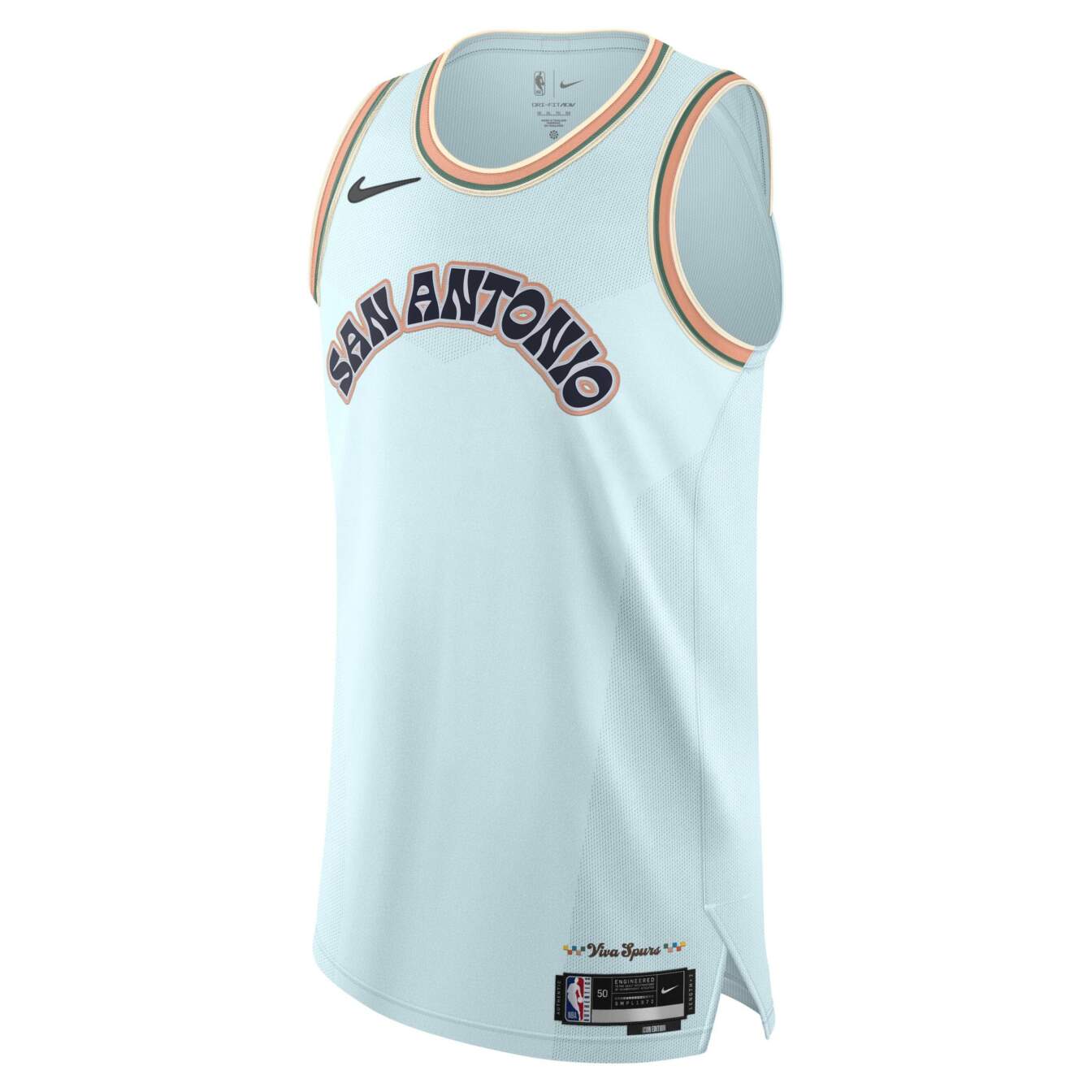
I want to promote these to the top tier. The font is whimsical, the teal blue base rocks and I love the orange and green trim. But given the astronomical heights the Spurs’ Fiesta jerseys have reached in the past, I can’t quite get there with the latest edition. It’s a good jersey that falls short of its potential.
These are good!
-
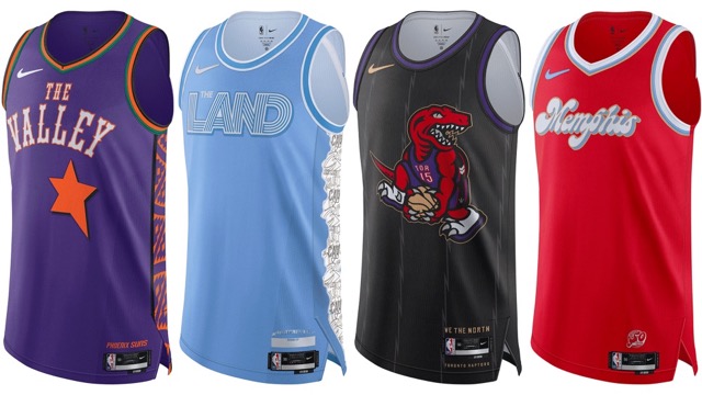
Phoenix Suns
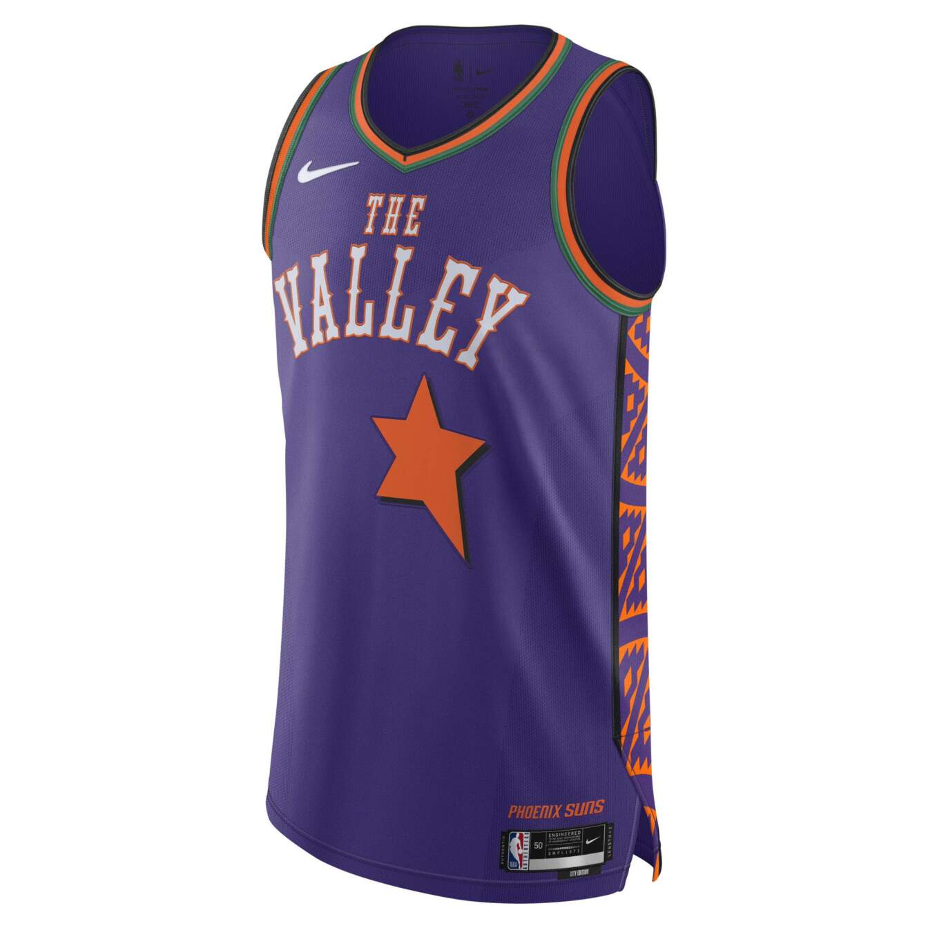
Purple and orange combine to create such a safe, vibrant color scheme and the Suns continue to utilize it in new, creative ways. I love the Western vibe the font and the star evoke. Taking inspiration from the stellar ‘95 all-star uniforms was an excellent choice.
-
Memphis Grizzlies
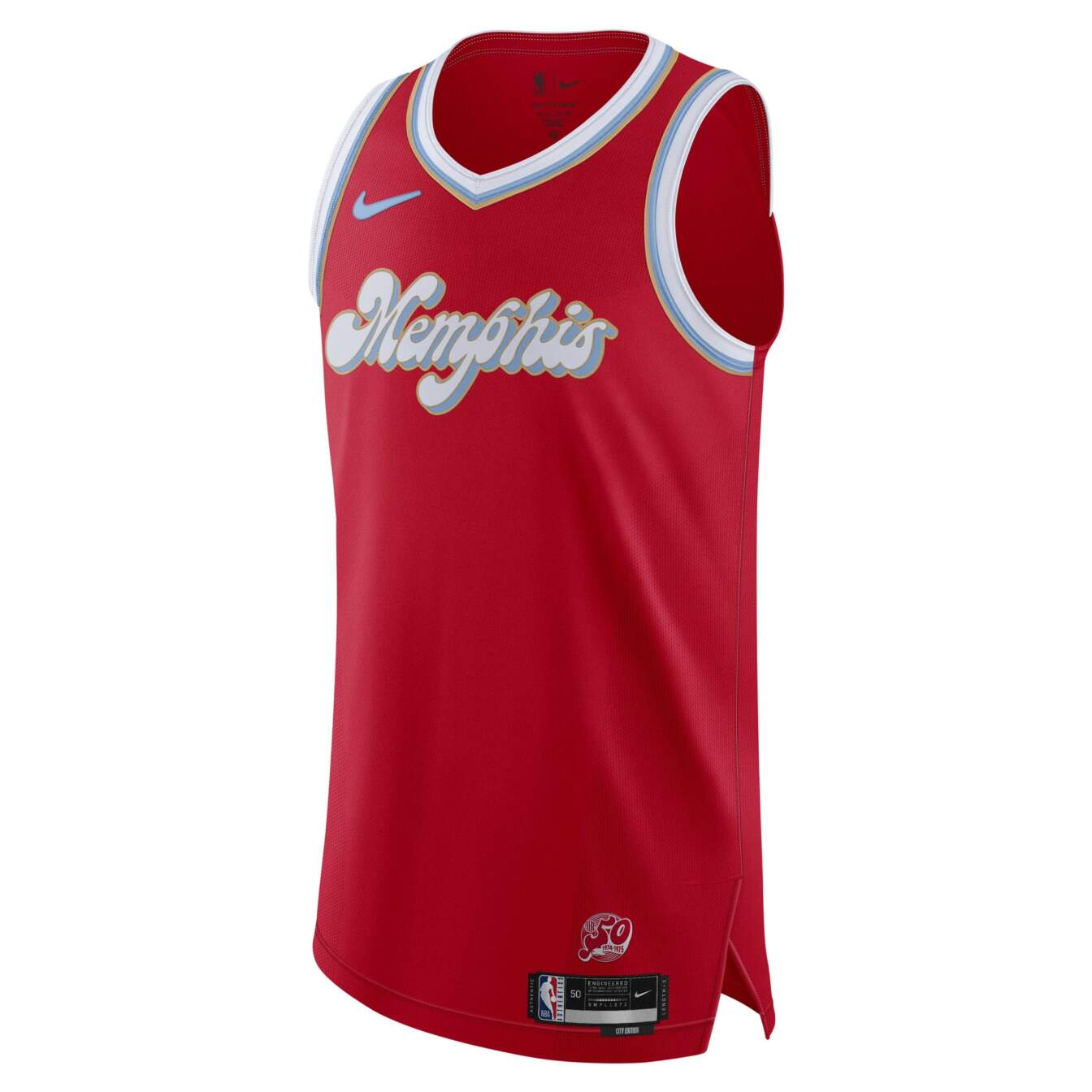
The bold, bright red looks wonderful on this one. Its font and trim complement the deep red, as the light blue, white and gold pattern contrast the vibrant base color. The stylized font is creative without being difficult to read. This one’s a winner.
-
Utah Jazz
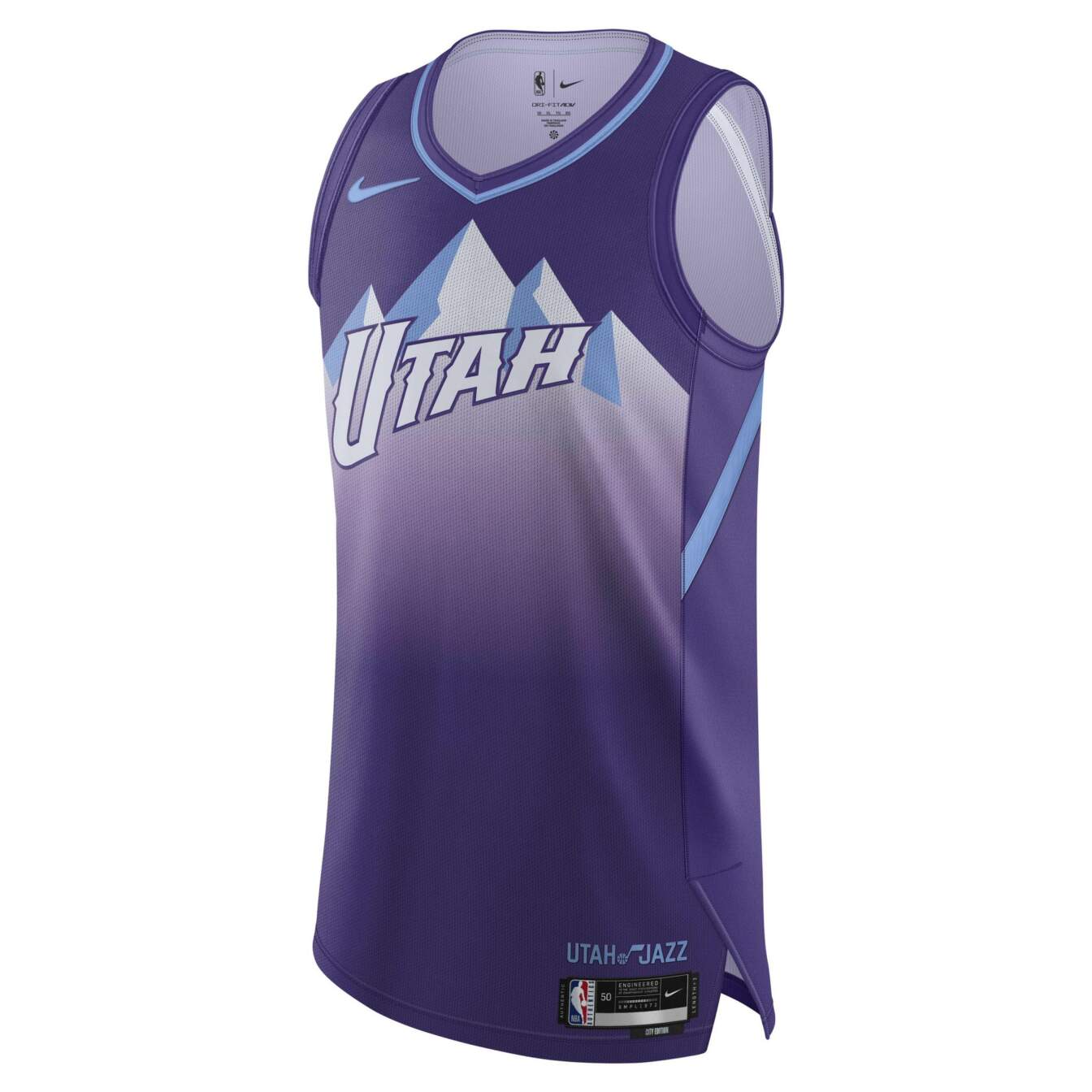
It feels wrong to rank a jersey we’ve seen so much before so high, but I can’t fault Utah for playing the hits. Deep purple and light blue might be the single best color combination a jersey can have, and the mountains blend seamlessly into the background. I dearly miss the orange kits, though. Hopefully we see those again one day.
-
Toronto Raptors
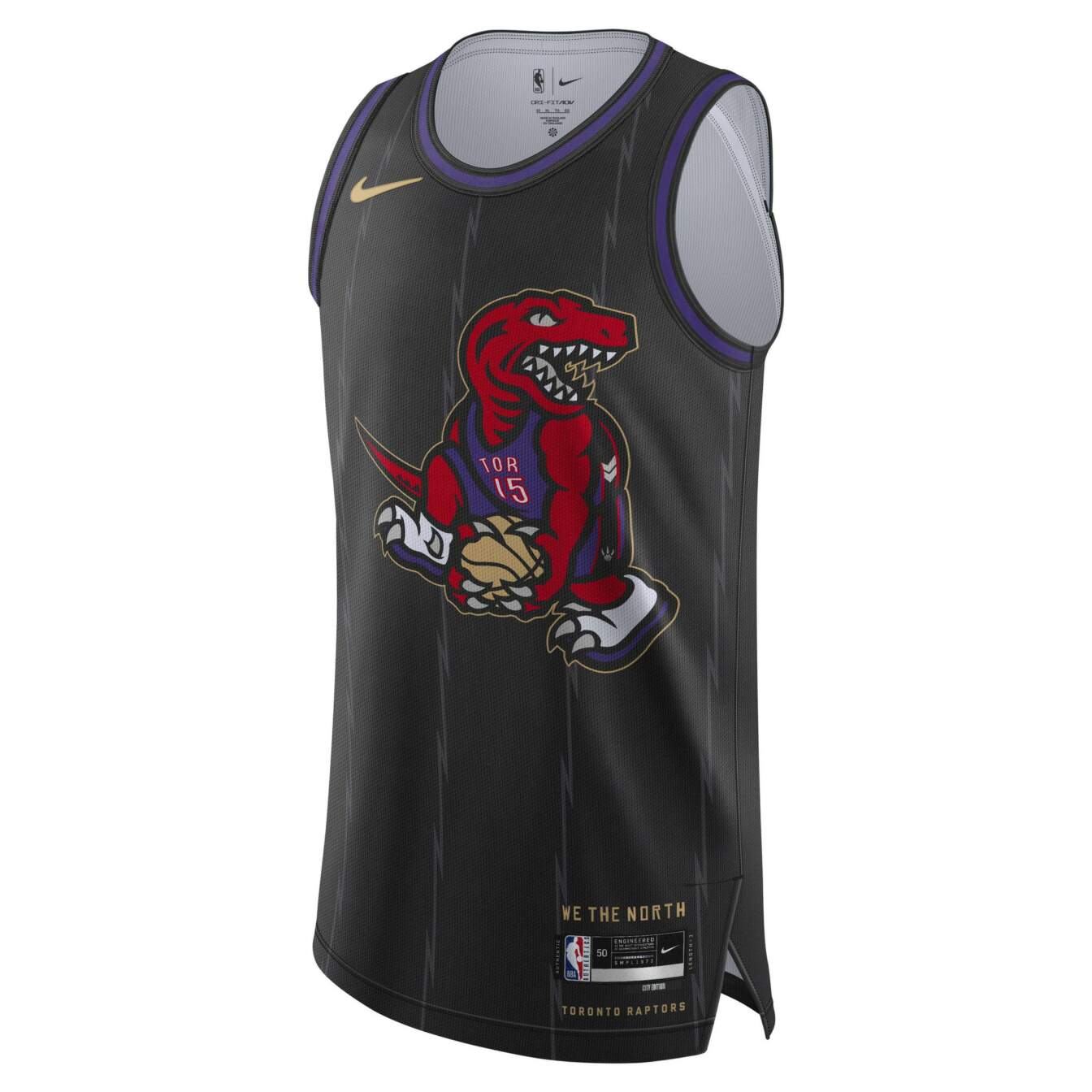
I feel no need to make a controversial pick at the top. The dunking dinosaur, this time superimposed on top of a basic black background, simply works. The lack of big text on the jersey works, too, as it probably would have conflicted with the Vince Carter-inspired logo.